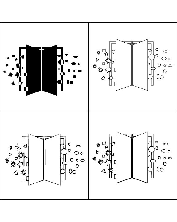
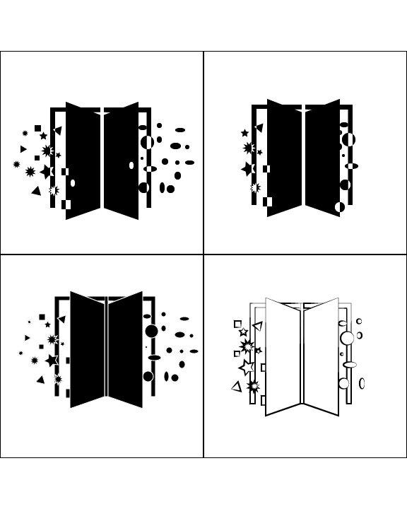
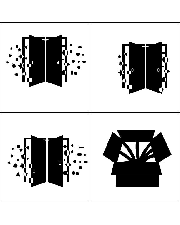
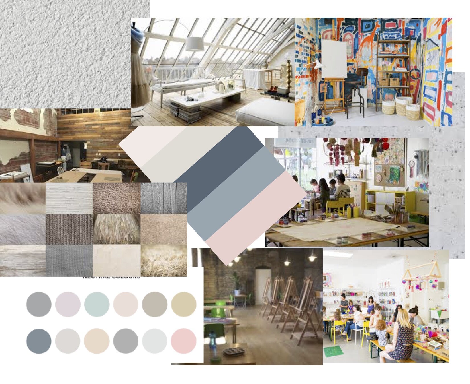
Art Escape is a business I created for a design class. It is an art studio that offers a child section where they have full creative freedom on their project while mom or dad can have a date night in a different area with a project and wine. This concept I created had a large impact on my designs.
Logo Variations
Infographic
HTML Website
Process Book







Process
Logo and Word Mark
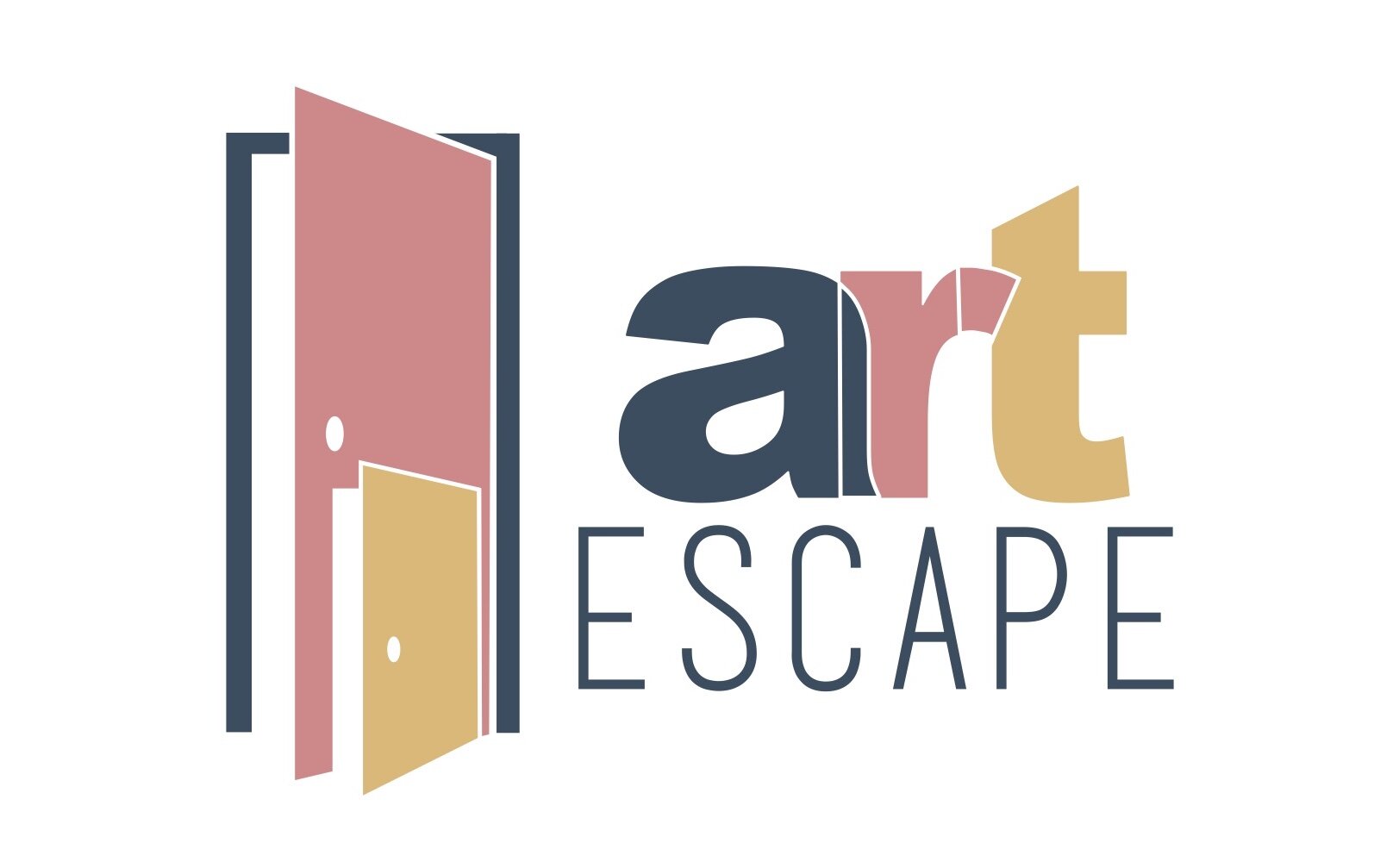
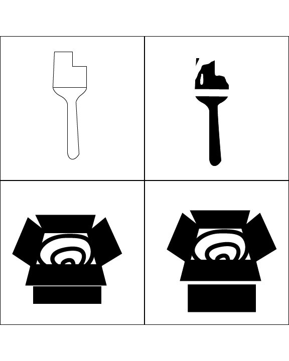
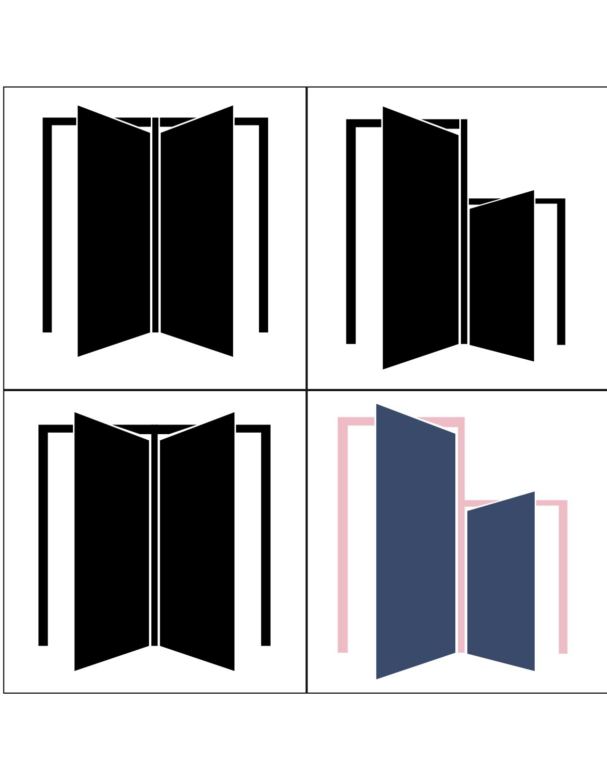
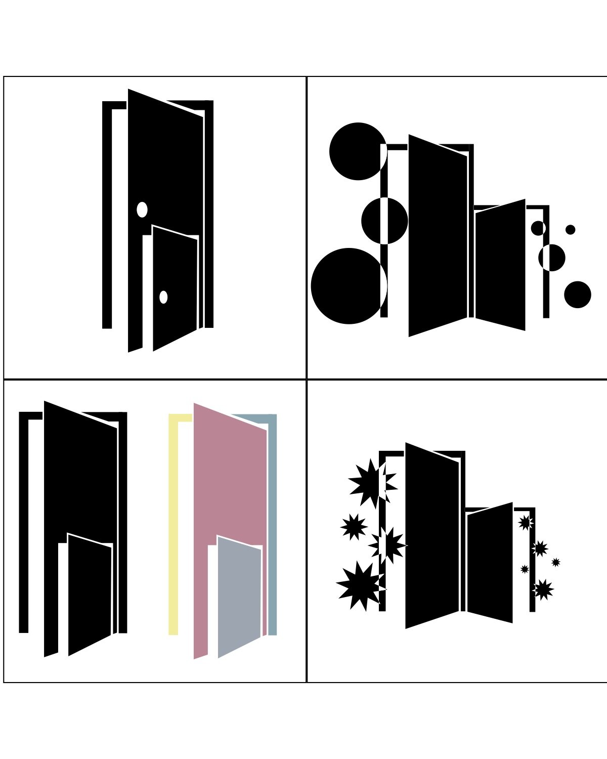
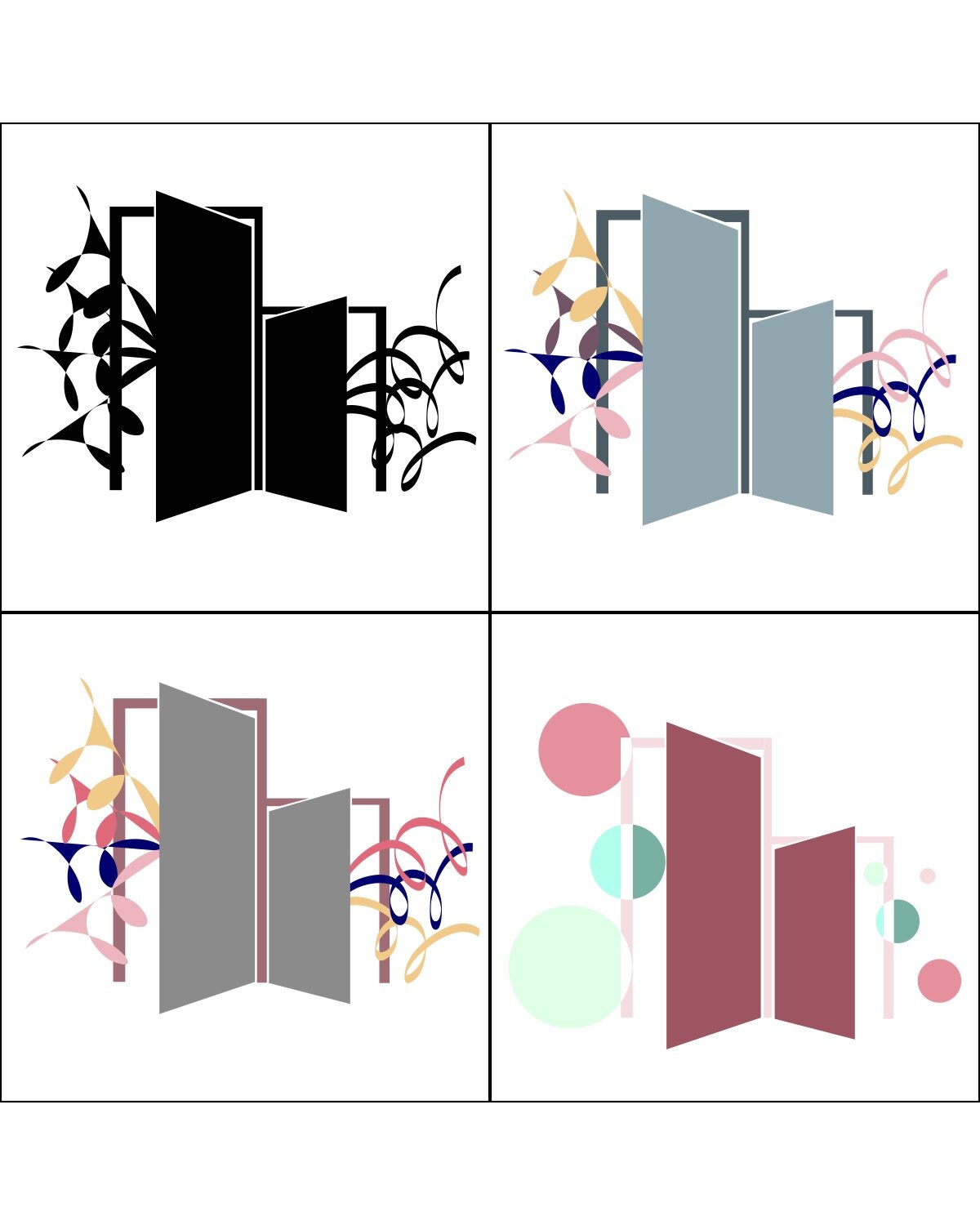
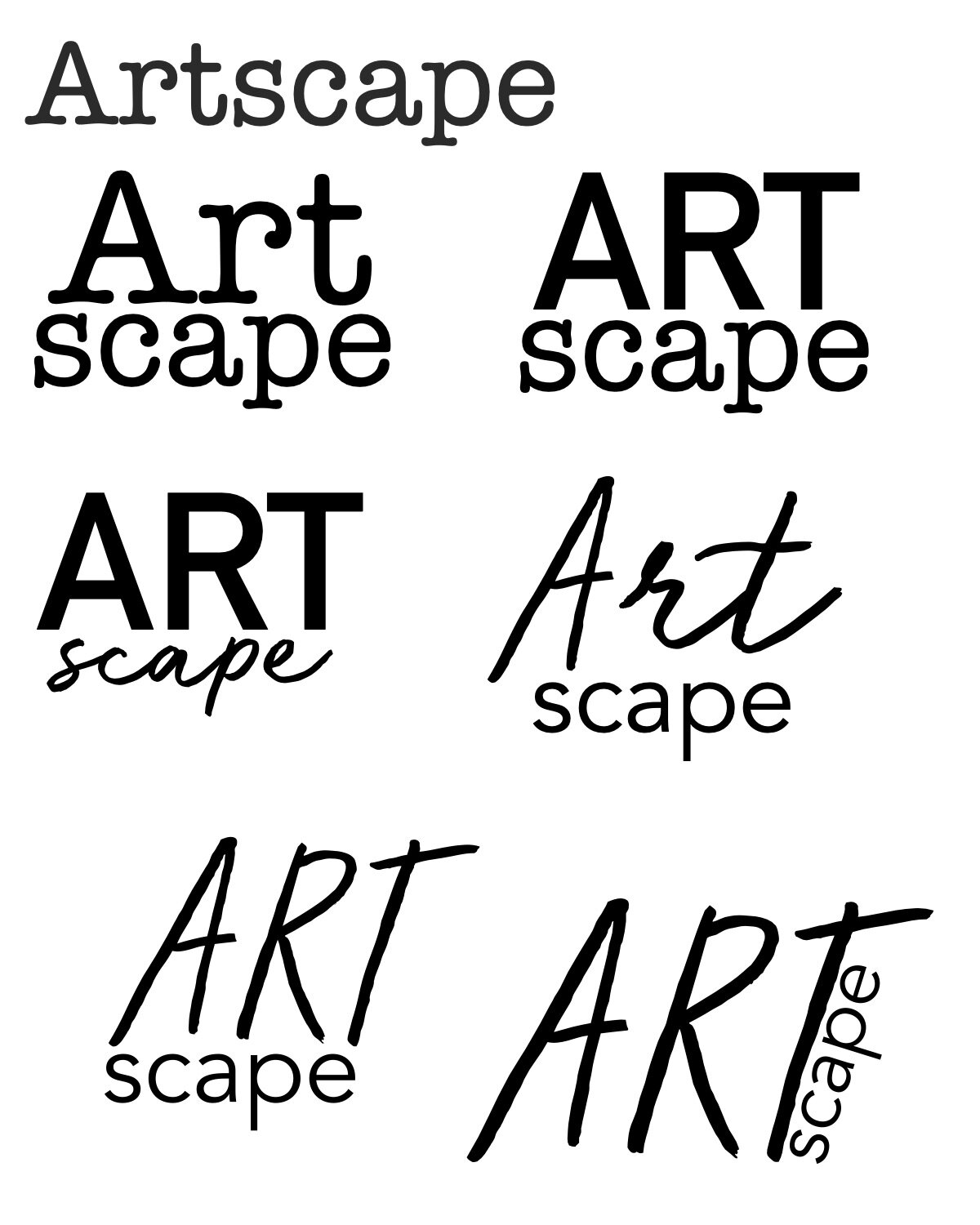
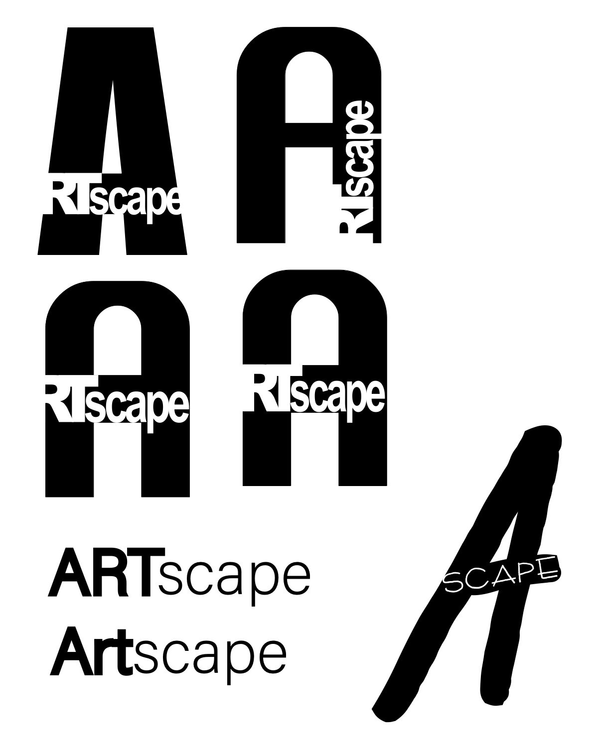
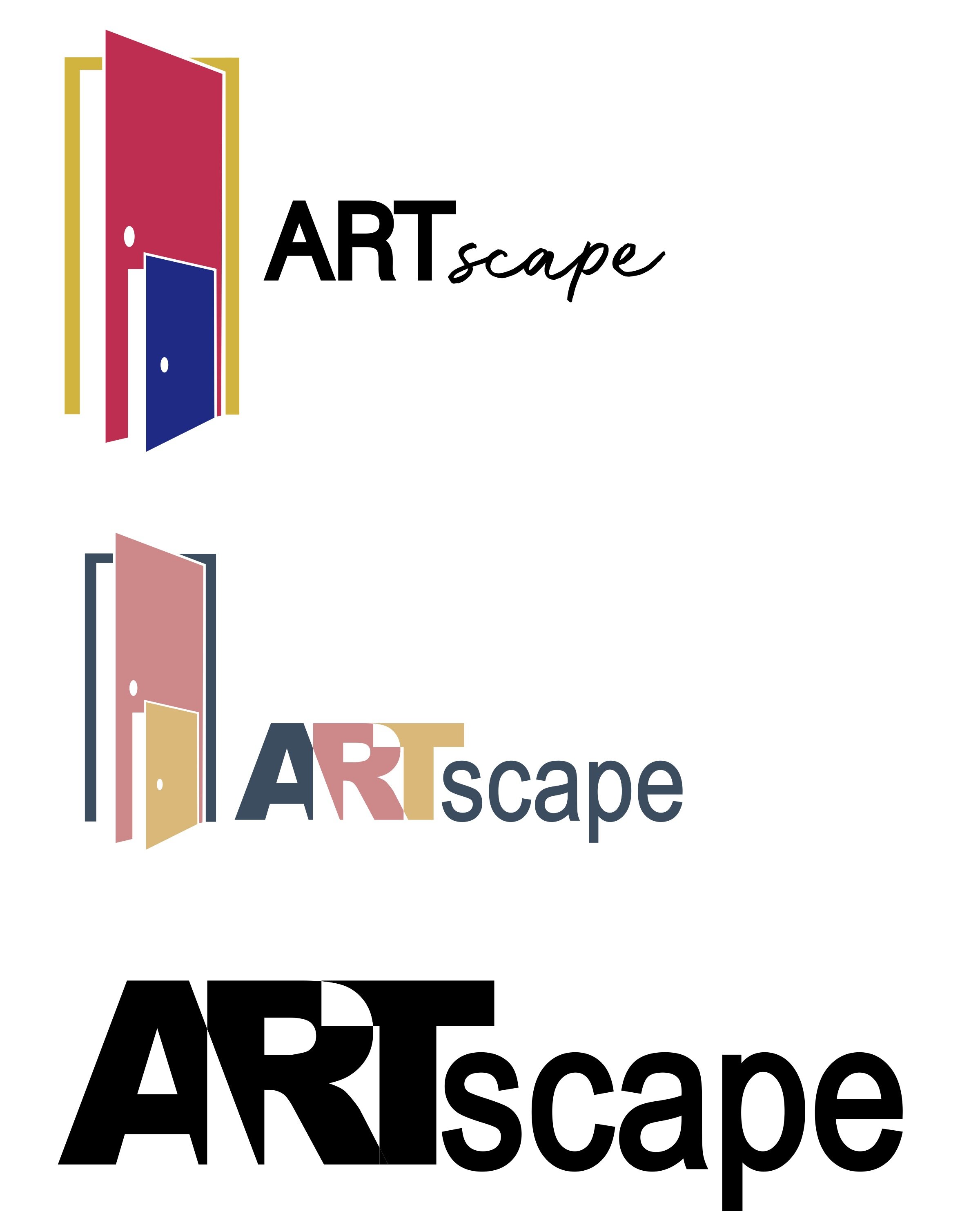
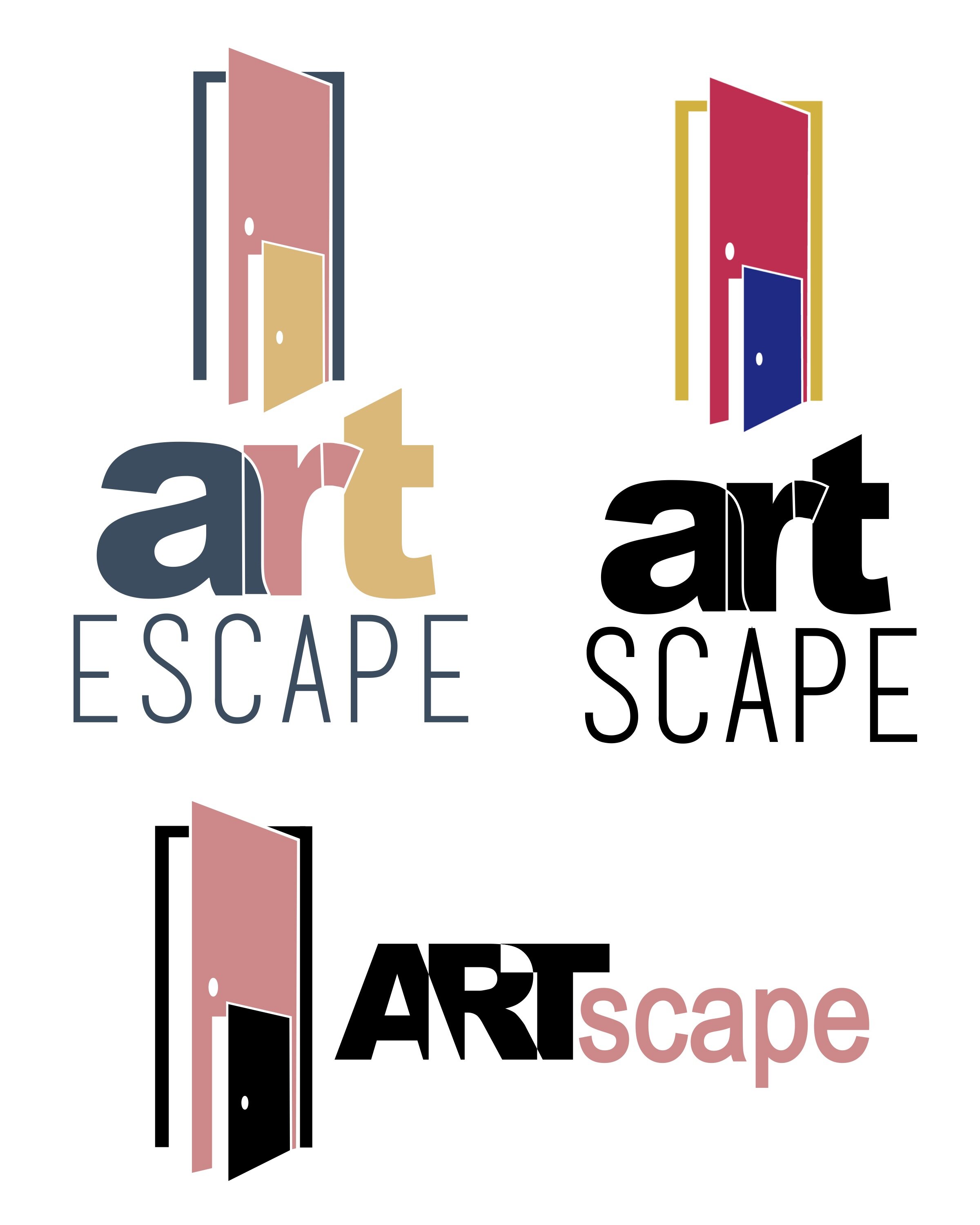
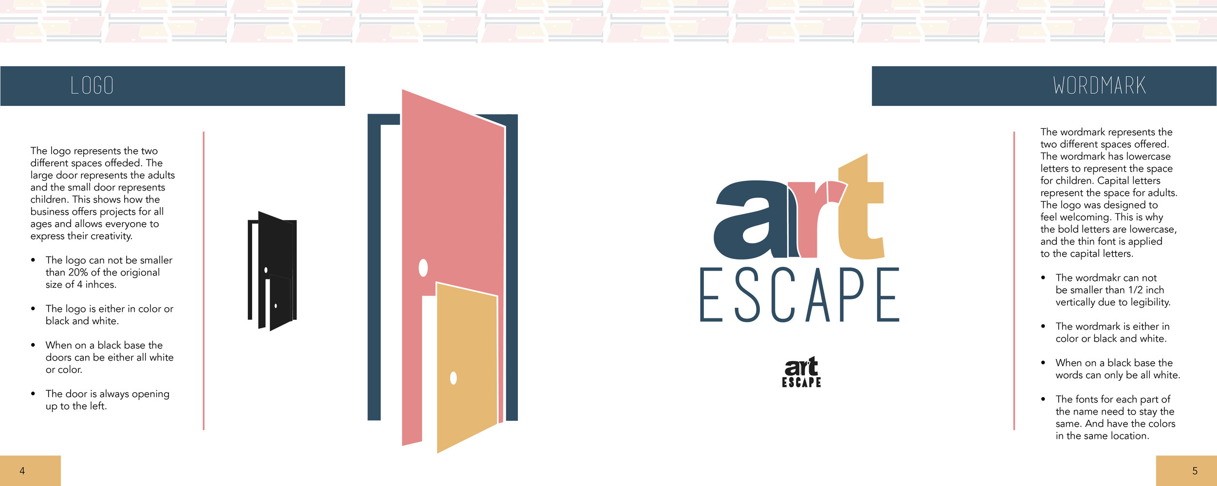
For the logo, I wanted to create something that showed it was for two different audiences. Out of my sketches, I was drawn to the doors and something that related an escape. I wanted the logo to appeal to all ages and relate to the concept. I started with bold letters and using that as a space for the second word. I bounced back and forth about the names Art Escape and Art Scape. But I realized it made people think of landscape.
The over-lapping missing section was a hit in the class. I continued to work on this design. Once finalizing the logo the capital art seemed very intimidating. So I made the top lowercase and the bottom capital but very thin. When it came to the placement of the logo next to the word mark I really loved it on the side and directly on top.
Infographic
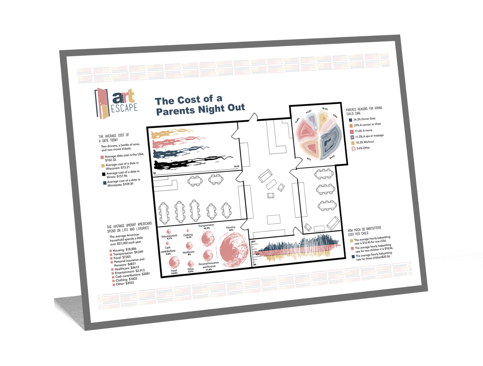
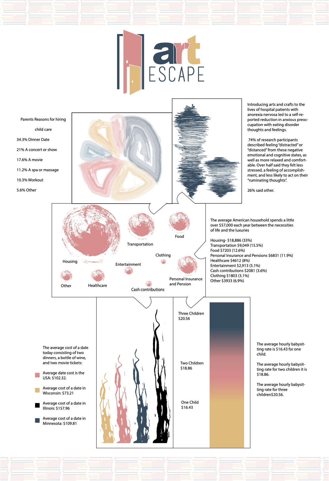
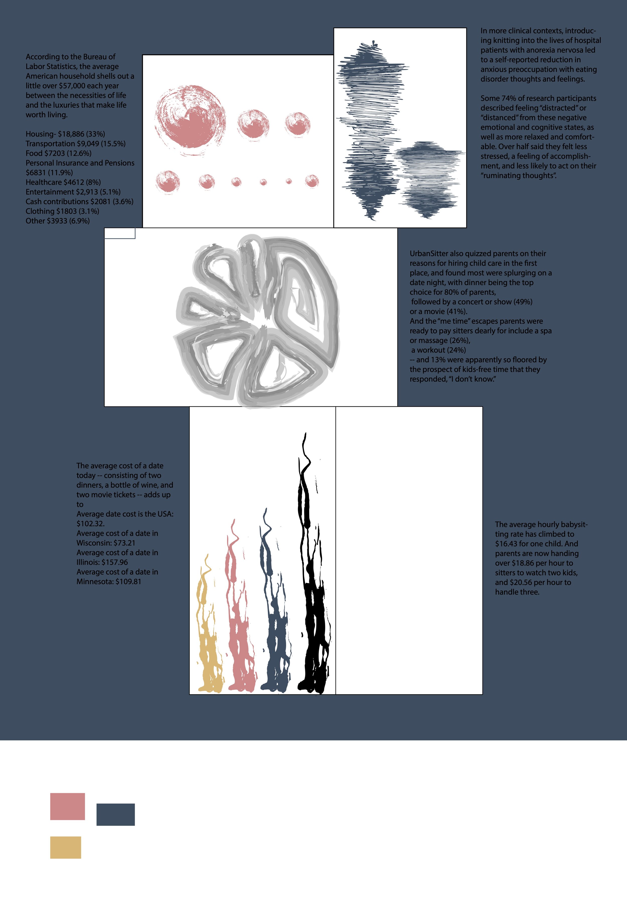
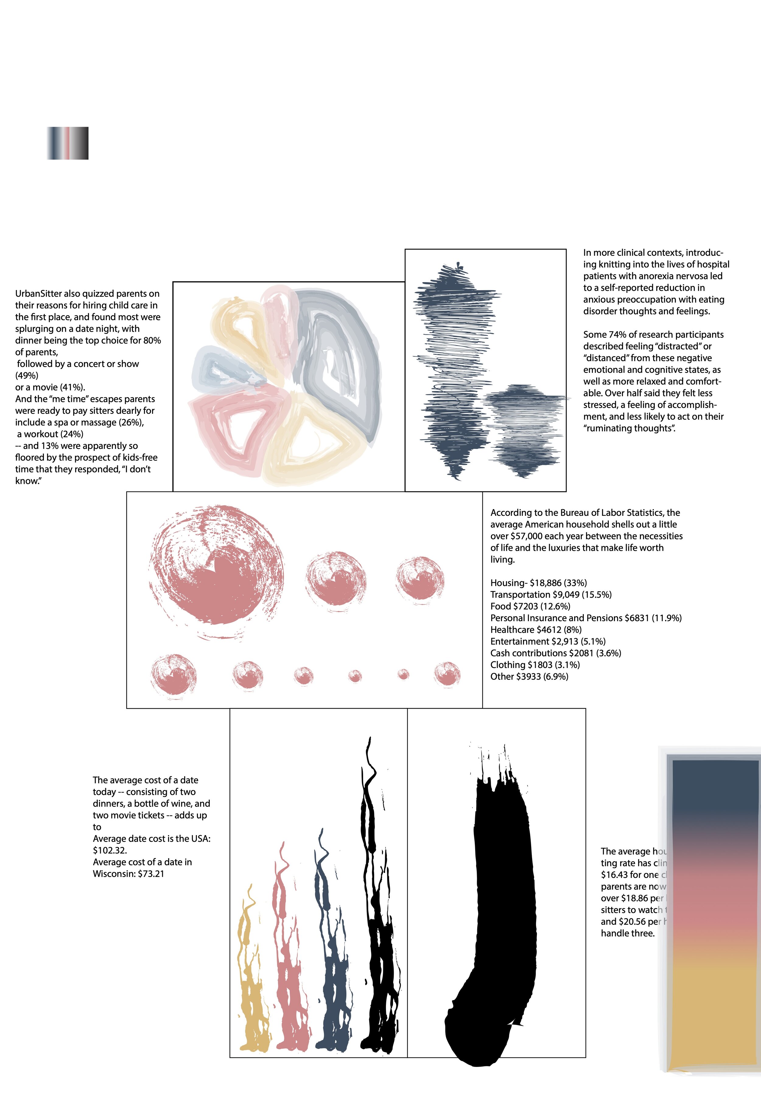
When making the infographic I wanted to create something that could explain the layout of the business. I chose to design it similar to a blueprint and have different information in the rooms. I made the information into graphs and used paintbrush tools to add color and interest. I tried a vertical layout first and ended up having trouble with the text placement. Changing to a horizontal canvas allowed me to organize the information clearly and make it look more like a blueprint.


